13 Mobile Form Design Best Practices and Examples for Beginners
We use our mobile phones for almost everything — from shopping online and booking appointments to completing inspections and gathering field data. So whether you're in retail, healthcare, or agriculture, mobile forms play a critical role in streamlining business processes.
Well-designed mobile forms help improve efficiency and minimize errors. However, their design requires special considerations to ensure users can easily interact with them on small screens.
This guide is aimed at beginners — those new to mobile form design and/or those who plan to use a no-code platform to build mobile forms and apps for their team or department.
We’ll walk you through the best practices you can follow to ensure your mobile forms are friendly, practical, and easy to use.
Why mobile form design requires special considerations
Designing mobile forms isn’t just a matter of shrinking a desktop form to fit a smaller screen. Here’s why:
- Less screen space: On a desktop, you have the luxury of displaying multiple fields, sidebars, and extra information all at once. On mobile devices, you’re working with significantly less screen real estate.
- Touch input instead of mouse and keyboard: Mobile forms rely on touch inputs, which are less precise than a mouse. This requires larger buttons, tap-friendly fields, and more spacing between elements to prevent accidental clicks.
- Variety of screen sizes: Mobile devices come in many shapes and sizes, from small smartphones to large tablets. Your form needs to be responsive, meaning it should automatically adjust and display correctly across different devices.
- Additional input options: Mobile devices offer powerful features you can leverage in your forms, such as biometric authentication, GPS, and the ability to scan barcodes or take photos directly from the form.
A well-designed responsive form adjusts layout, field sizes, and button placement based on the device it’s viewed on. This eliminates the need for users to zoom in or out, providing a smoother, more intuitive experience.
One of the best things about using no-code platforms like Forms On Fire (compared to programming everything from scratch) is that they handle the technical aspects of responsiveness for you. This saves more time than you think.
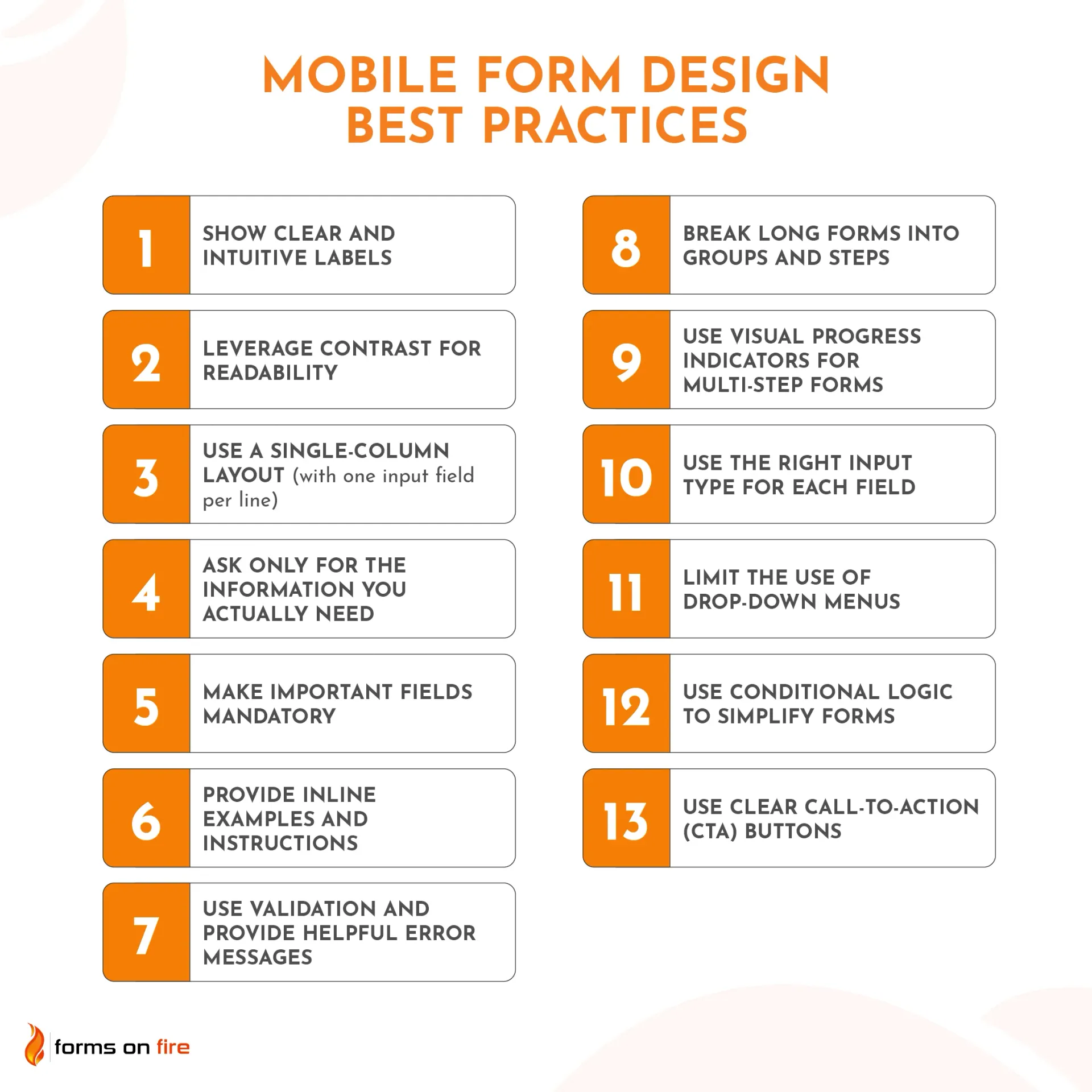
Now that we set the stage, on to the mobile forms design examples and best practices!
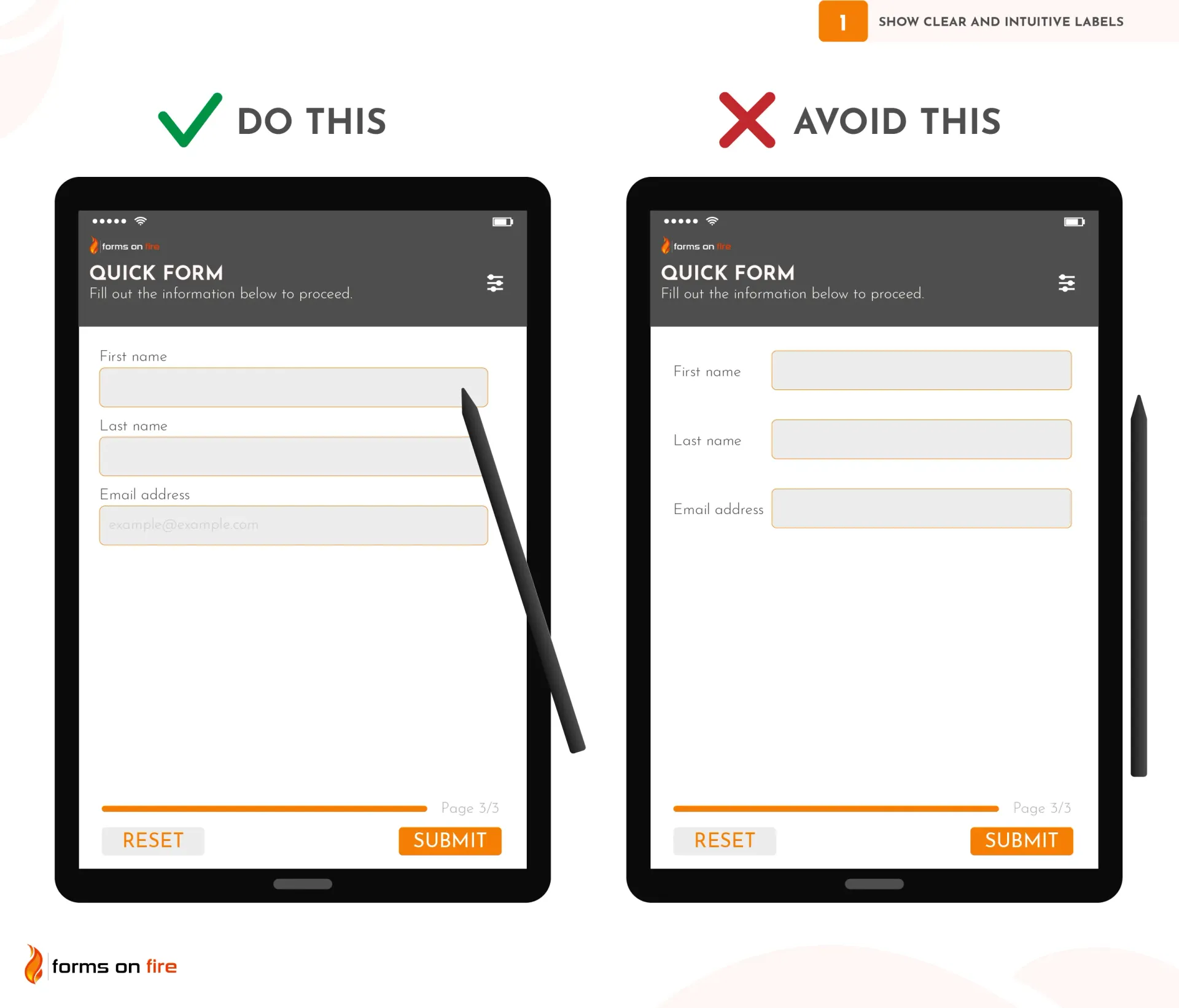
1) Show clear and intuitive labels
When designing mobile-friendly forms, clear and intuitive labels are critical to guiding users through the form without confusion. They need to be easy to read and understand at a glance.
The best practice is to place labels above the input fields rather than to the left or within the field itself (a.k.a placeholder text).
Why? On mobile, space is limited, and when users start typing in a field, any placeholder text or inline labels disappear, making it harder for them to remember what they’re supposed to input.
Instead, you can use placeholders for additional guidance or examples (e.g., format hints like "example@example.com" for an email address) while still maintaining a proper label above the field.
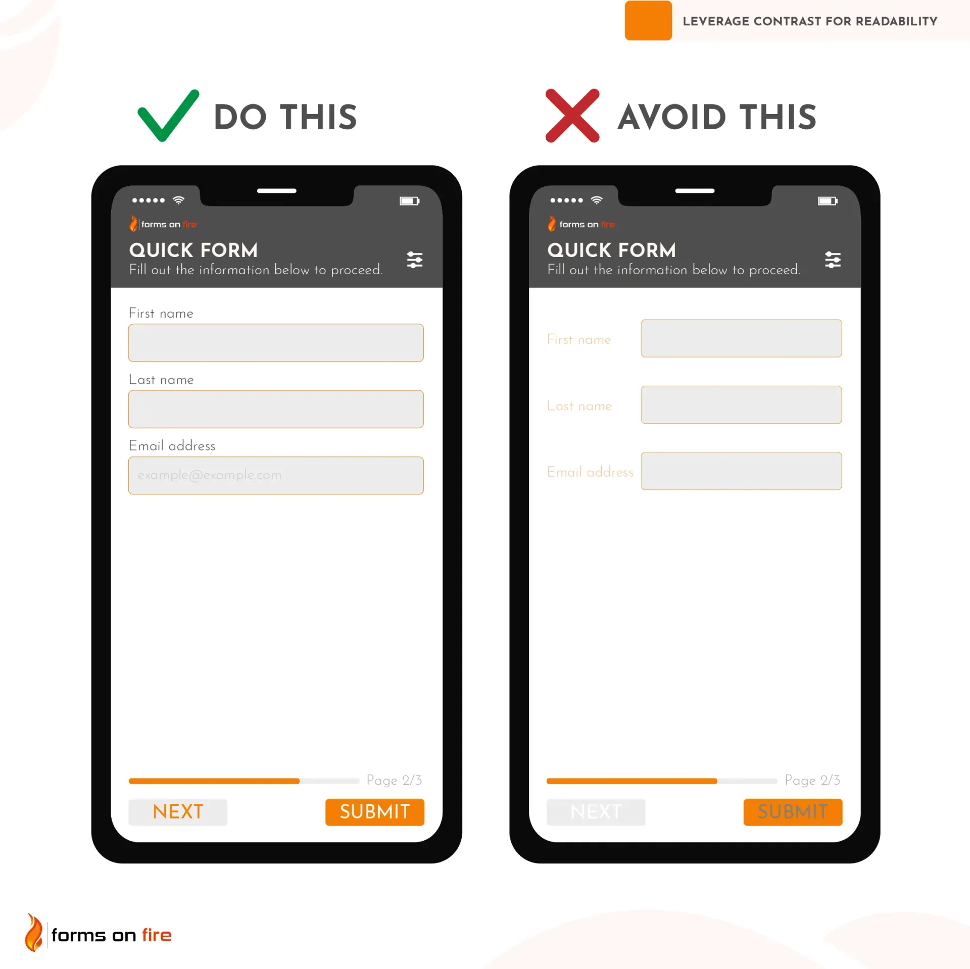
2) Leverage contrast for readability
Mobile forms are going to be used in a variety of lighting conditions, from bright sunlight to dark rooms. If users can’t read your form easily, they’re more likely to make mistakes, miss important fields, or abandon the form altogether.
Having high contrast between text and background is one of the very first principles you learn as a designer. Unfortunately, it’s still a common mistake we encounter in practice — which is why we included it on this list.
As a general rule, dark text on light backgrounds offers the best readability. For example, black or dark gray text on a white or light gray background works well in almost any scenario.
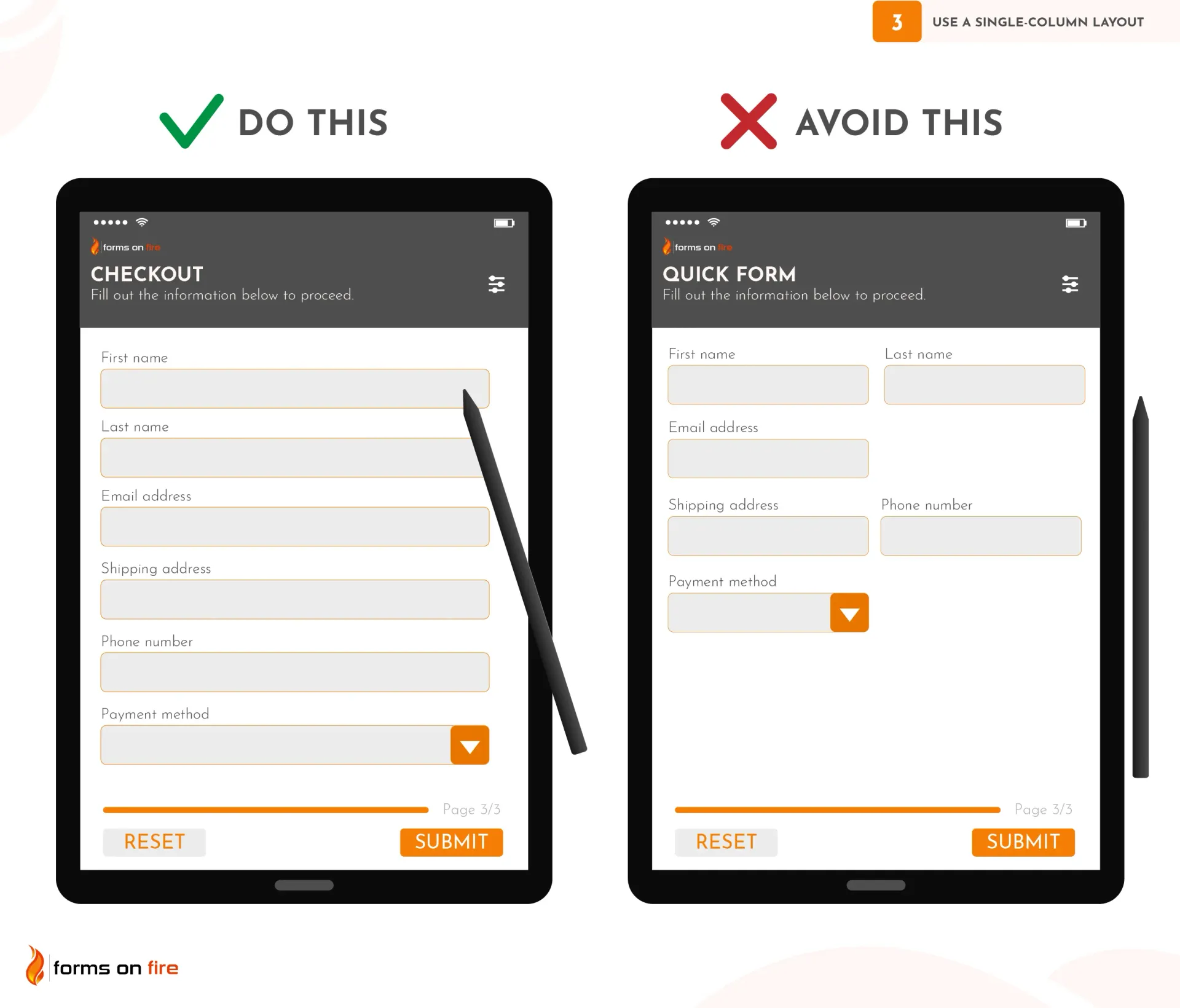
3) Use a single-column layout (with one input field per line)
Mobile users tend to scan forms vertically rather than horizontally. A single-column layout helps guide the user’s attention in a straight, logical path from top to bottom, reducing confusion and preventing errors.
This way, users are less likely to overlook questions, input the wrong data in the wrong field, or have to constantly zoom in and out.
To create an effective single-column layout:
- Stack fields vertically: Make sure each form field has its own row, and fields are stacked on top of each other in a linear fashion.
- Reduce visual clutter: Avoid crowding fields by placing too many on one screen. Give enough padding between fields so users can easily tap each one without accidentally selecting another.
- Use no-code tools: Most no-code platforms, like Forms On Fire or Jotform, provide pre-made templates that use single-column layouts by default. You can easily rearrange fields using drag-and-drop functionality to ensure your form follows a vertical format.
Practical tip: For complex forms with many fields, consider breaking the form into steps or sections (we'll cover this in detail later), but still maintain a single-column format within each section. This keeps things manageable and avoids overwhelming the user with too much information at once.
4) Ask only for the information you actually need
Every additional field you add to a form increases the effort required to complete it.
In business, mobile forms are often used to automate workflows and improve efficiency. Asking unnecessary information can undermine that efficiency, making the process slower and more cumbersome than it needs to be.
To streamline your mobile forms, follow these steps:
- Identify essential fields: Think carefully about the information you really need to collect. If a field doesn’t directly contribute to your end goal, consider removing it.
- Eliminate redundant fields: Avoid asking for information you already have or can obtain through other means. For example, if a user is logged into an account, you probably don’t need their name or email again.
- Group related information: Sometimes, multiple pieces of information can be grouped into a single field. For example, instead of asking for separate “First Name” and “Last Name” fields, you might just ask for “Full Name.”
TL; DR: When it comes to mobile forms, less is definitely more.
5) Make important fields mandatory
Mandatory fields ensure that you collect the minimum required information to complete a transaction, process a form, or move forward with the next steps.
Whether it’s a contact form, an order form, or a data collection form, missing critical fields (like email or phone number) can lead to incomplete submissions, making it difficult for you to act on the information.
However, while it's important to mark some fields as required, overusing mandatory fields can frustrate users.
Here’s how to strike a balance between essential and optional information to maintain a smooth user experience:
- Clearly mark mandatory fields: Use visual indicators like asterisks (*) next to required fields or place a “Required” label next to the field name. This lets users know exactly which fields they must fill out.
- Show error messages for incomplete mandatory fields: If a user attempts to submit the form without completing all required fields, let the user know which specific field they missed and what they did wrong.
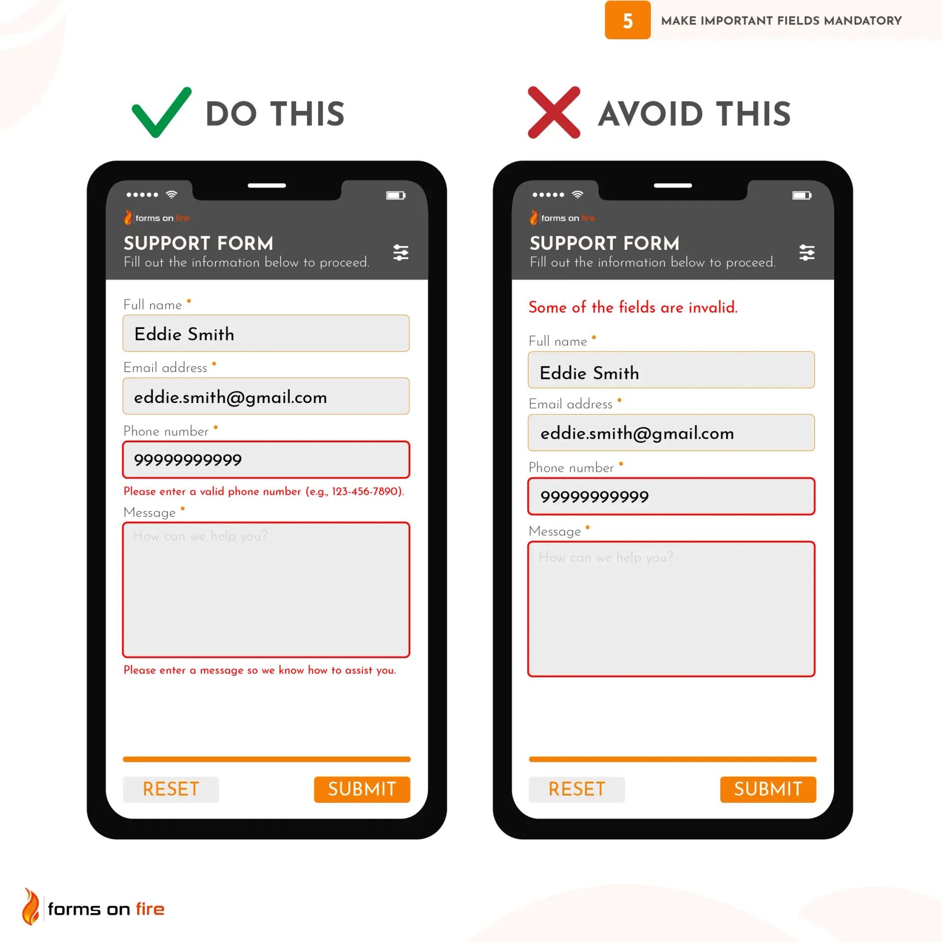
Practical tip: Most no-code platforms make this process simple by offering built-in toggles or checkboxes that allow you to mark fields as required. You can easily specify which fields are mandatory, and the platform will handle the rest.
6) Provide inline examples and instructions
While it is clear to you, some users may struggle with understanding what format or type of information is required. Do yourself a favor and use inline examples and instructions as subtle guides.
There are a few ways to do this effectively:
- Use placeholder text: For example, in a phone number field, you could use “(XXX) XXX-XXXX” to show the expected format. Similarly, for a product serial number field, you could use “Enter your serial number (format: 2 letters, followed by 8 digits). Example: AB12345678” as a placeholder.
- Provide tooltips or help Icons: For fields that require more explanation, you can use a small help icon (like a question mark) next to the field. When clicked or hovered over, it can display additional instructions or an example.
- Display format hints below the field: For fields like passwords or addresses, showing instructions or examples just below the input field (like "Enter a strong password with at least 8 characters" or "Street, City, State, Zip") can help ensure users submit the correct information.
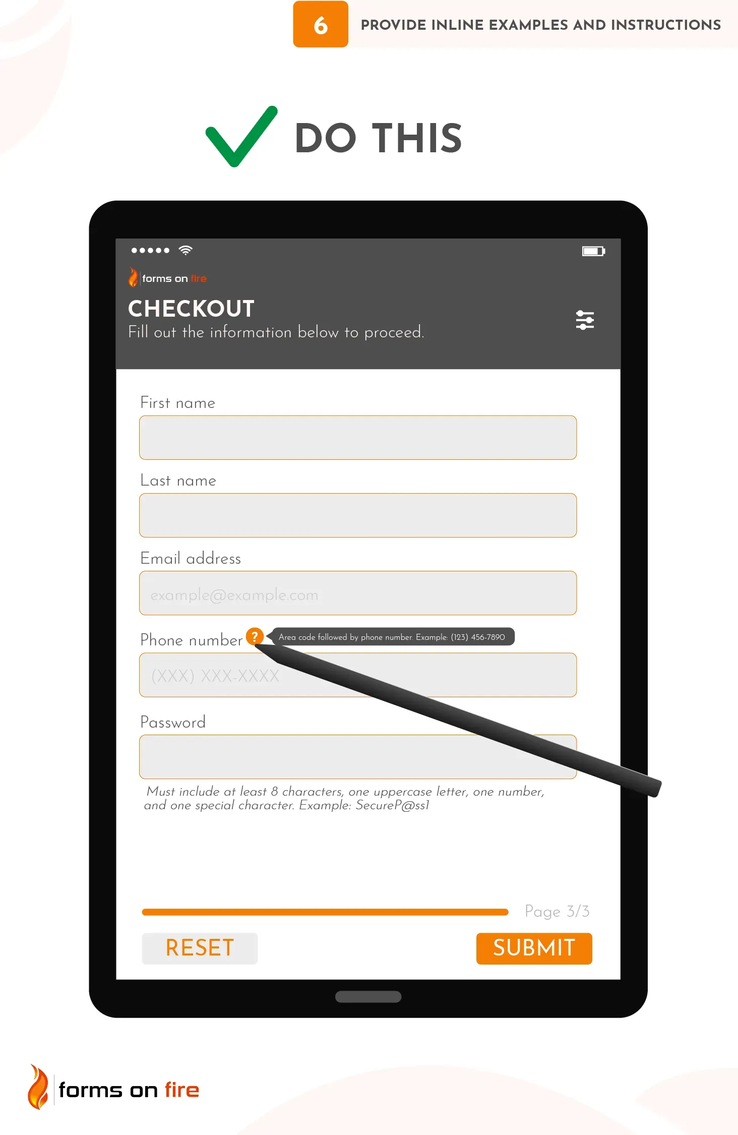
You can spend a few minutes during mobile form design to implement these instructions — or a few hours fixing data errors later on. It’s an easy choice.
7) Use validation and provide helpful error messages
Field validation ensures that the data users submit is accurate and usable. It checks the data entered into each form field to ensure it meets specific criteria.
For example, you can validate that:
- A phone number is in the correct format.
- An email address contains the “@” symbol and a valid domain.
- The date is entered in the correct format (e.g., MM/DD/YYYY), and is not a future date (if applicable).
- A password meets your security criteria (e.g., length, character types).
- Time tracking data is consistent and in the right format (minutes vs hours).
- GPS coordinates are entered in the decimal format and, if needed, fall within specific geographic boundaries.
- Uploaded photos are of the acceptable size (e.g., maximum 5 MB) and file type (e.g., JPG, PNG).
- All required checklist items are checked off before the form can be submitted (useful for various inspections, safety forms, and compliance audits).
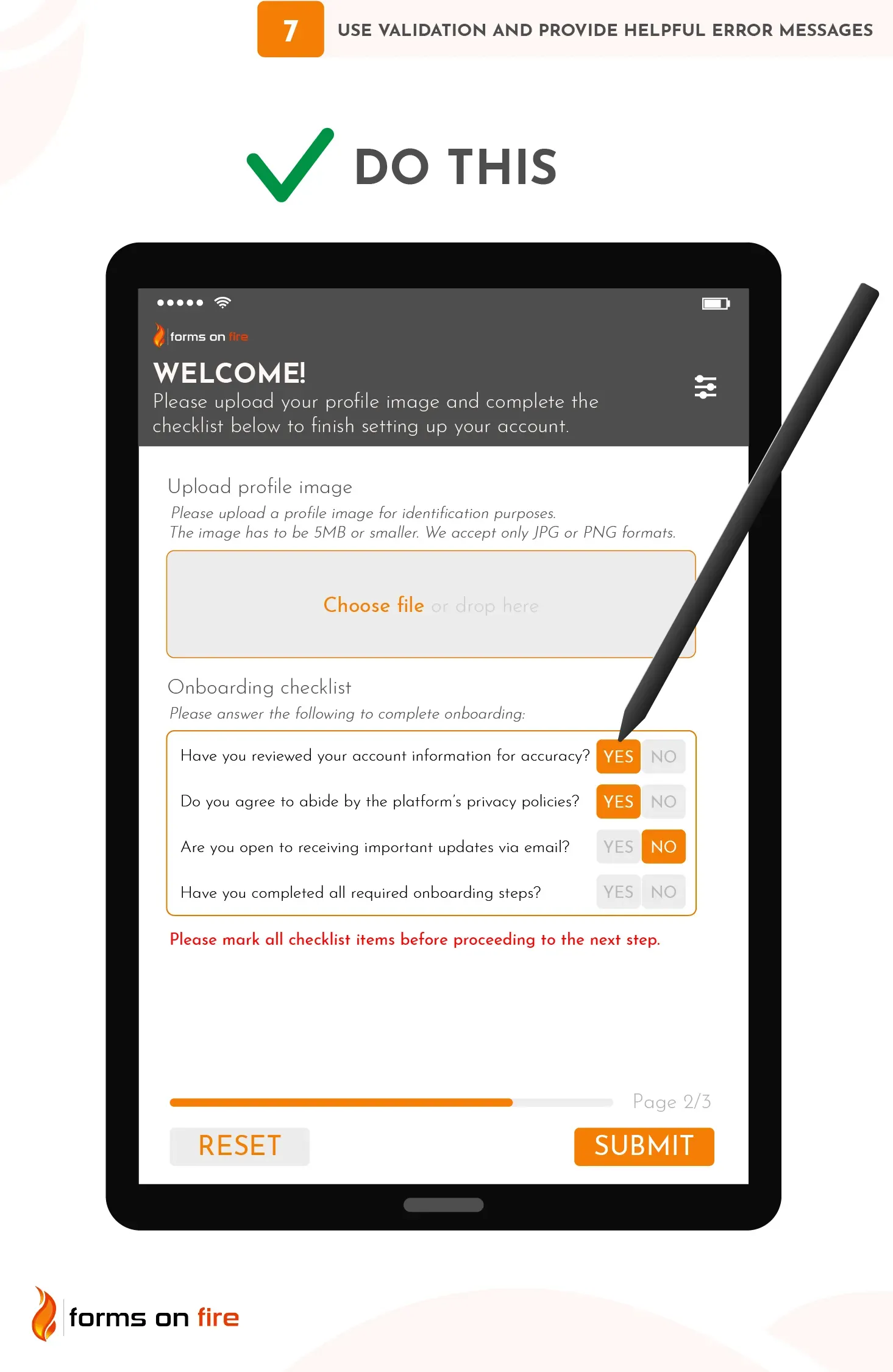
When implementing validation, there are a few important things to focus on:
- Inline validation: Implement real-time validation, so users are alerted to errors immediately after filling out each field rather than at the end when they try to submit the form.
- Use clear and specific error messages: Error messages should appear directly below or next to the problematic field, and they should clearly explain what went wrong. Instead of vague messages like “Invalid input,” be specific: “The phone number you entered is too short. Please enter a 10-digit phone number, including area code (e.g., 123-456-7890).” This helps users fix mistakes without confusion.
- Limit the number of answers: Where it makes sense you can implement dropdown selections, yes/no fields, and multi-select fields (like checkboxes).
- Practical tip: No-code platforms usually have built-in validation options that allow you to specify criteria like required fields, character limits, and acceptable formats.
8) Break long forms into groups and steps
Long forms are tedious to complete, especially on mobile phones. If you need to create a digital form with dozens of inputs, break it down into manageable chunks. This gives the feeling of progress without overwhelming the user with too much information at once.
This approach is particularly useful in mobile forms for field inspections, audits, or surveys where large amounts of data need to be captured, usually in a step-by-step fashion.
Try out these tips to improve the flow of your forms:
- Group related fields: Divide your form into sections based on the type of information being requested. For example, in an inspection form, you might have sections for “Personal Information,” “Inspection Details,” “Safety Checks,” and “Final Notes.”
- Use headers and sub-headers: Clearly label each section with headers or sub-headers so that users know what type of information is being requested. For example, use headers like “Step 1: Enter Your Contact Information” or “Step 2: Equipment Status Check” to guide users through the process.
- Break into steps or pages: For very long forms, consider using multi-step forms that span several pages. Each page should cover one section or group of fields, with “Next” and “Previous” buttons allowing the user to move through the form at their own pace.
In the screenshot below, you can see how one of our clients used Forms On Fire to group forms for different aspects of their farming operation.
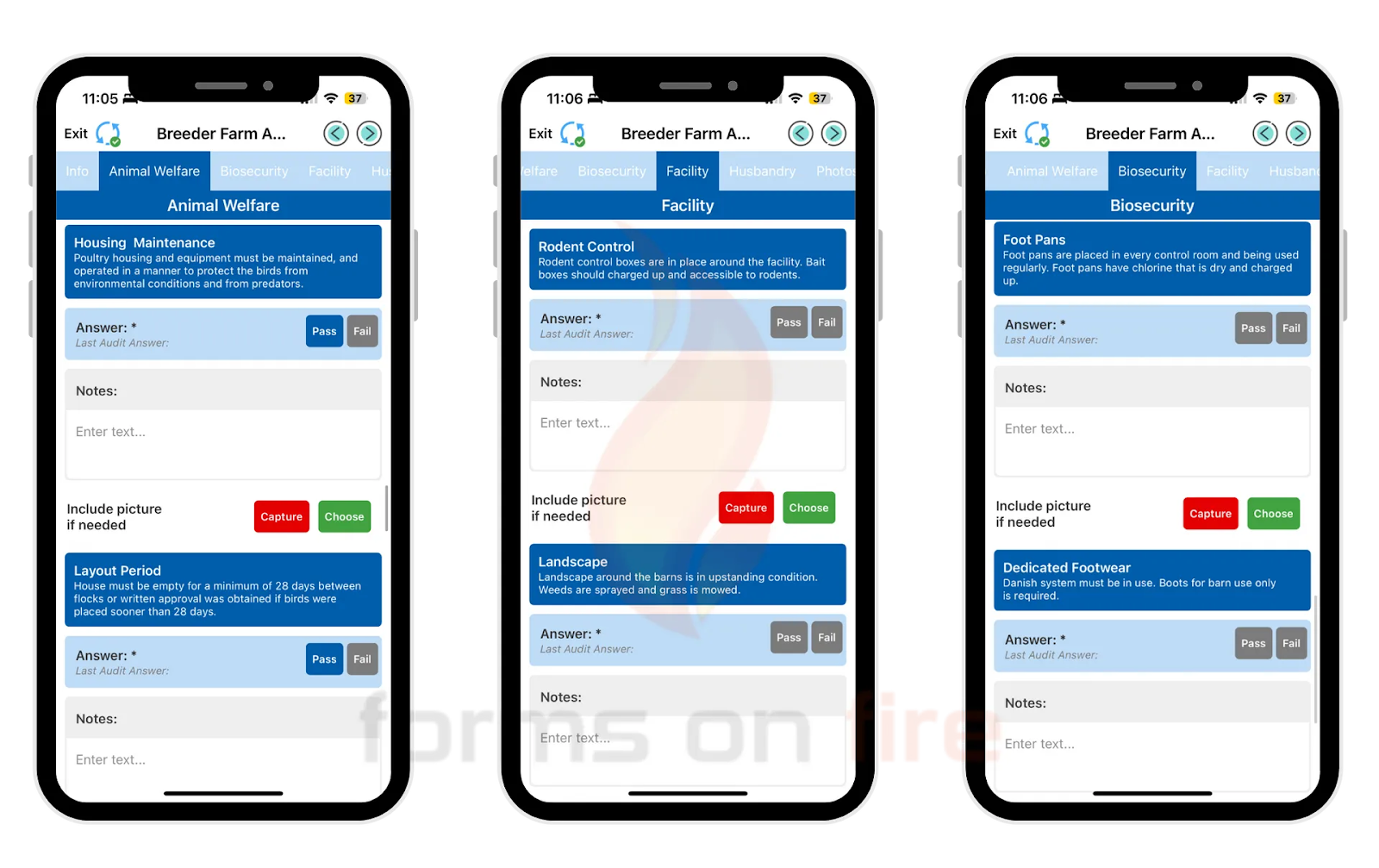
Practical tip: Most no-code platforms provide simple tools to group fields into sections or steps. For example, you can use drag-and-drop features to create collapsible sections or use a step-by-step form builder that lets you break the form into different pages.
9) Use visual progress indicators for multi-step forms
When users are filling out a multi-step form, let them know how far along they are in the process. Give them a clear sense of their progress using visual progress indicators.
These can be:
- Progress bars: A horizontal progress bar at the top or bottom of the form, often marked in percentages (e.g., "50% complete") As the user completes each section or step, the bar fills up, giving them a clear idea of their progress.
- Step numbers: You can break the form into distinct steps and show the user their current step, as well as how many steps are remaining. For example, if a form has five steps, the top of the screen might display "Step 3 of 6."
- Breadcrumb navigation: Breadcrumbs are especially useful if users need to go back and review or change a previous response. For example, labels like “Personal Info > Inspection Details > Final Notes” allow users to see both where they are and where they've been.
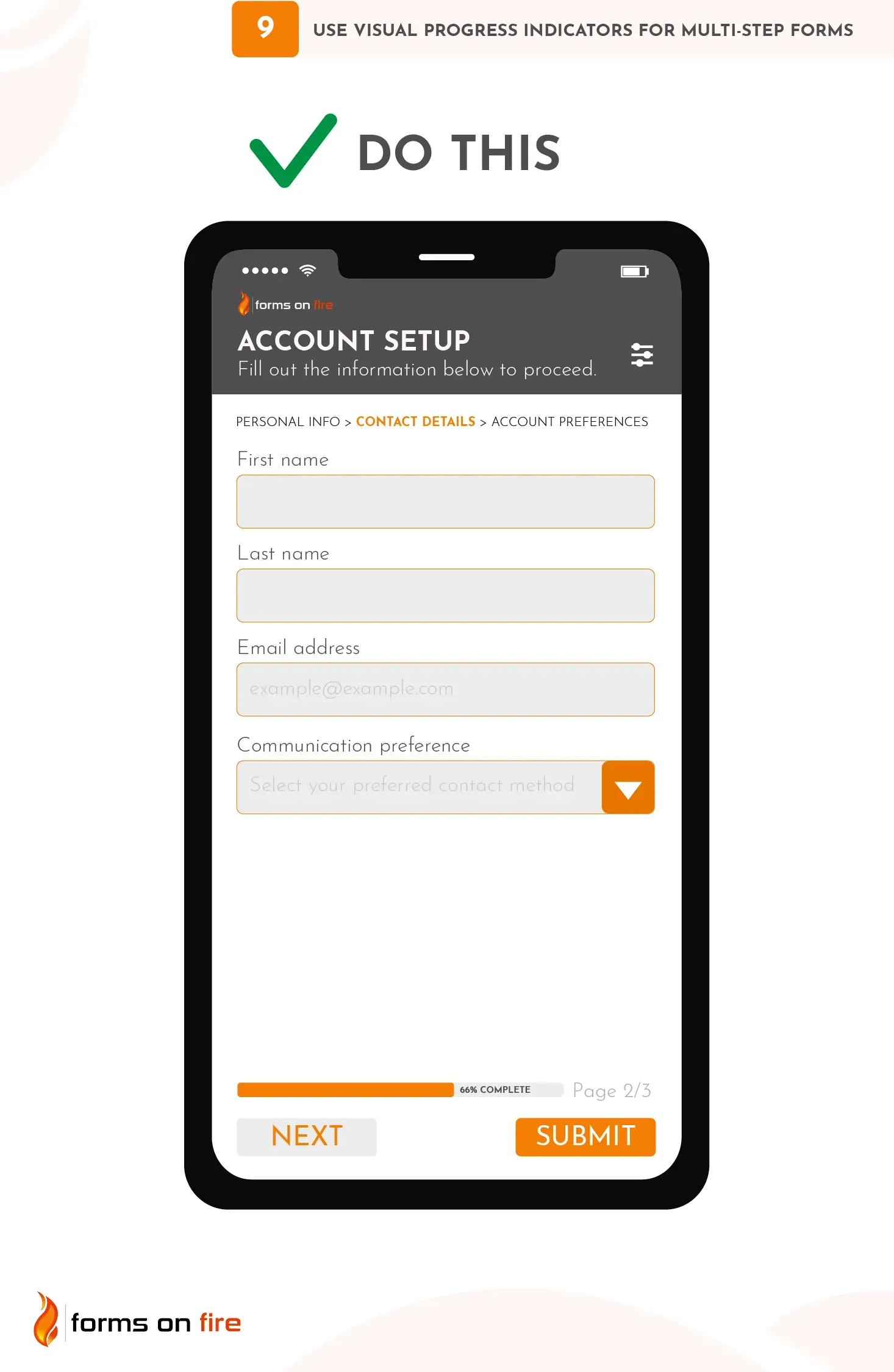
Practical tip: Virtually all no-code platforms offer built-in progress bar features or step-based navigation tools. When setting up multi-step forms, simply select the option to enable progress indicators, and the platform should automatically generate them for you. You can usually customize the style and wording of these indicators to suit your form’s needs.
10) Use the right input type for each field
Different types of data require different types of input. You can have date pickers, numeric fields, notes, images, email inputs, digital signatures, and so on.
To simplify the process and minimize the possibility of incorrect data entry, numeric fields should prompt a numeric keyboard, date fields should bring up a calendar, image fields should open a camera or the image folder, etc.
If you want to take your mobile form design up a notch, for fields that require numeric ranges (such as entering current fuel levels; 0% to 100%), you can use sliders or stepper controls to allow users to select values easily without typing.
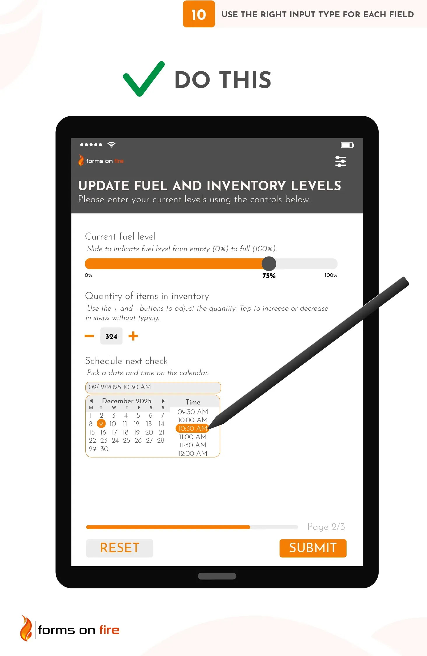
Lastly, when you expect detailed responses (such as notes from an inspection or audit), use a text area that allows for multi-line input, rather than a single-line text field.
Practical tip: No-code platforms like Forms On Fire allow you to easily specify the input type for each field. Whether you're working with numeric, text, date, or email fields, the platform will automatically adjust the form’s behavior based on the selected input type.
11) Limit the use of drop-down menus
While drop-down menus can be useful, they are not always the best option for mobile forms as they often require multiple taps and scrolling.
For example, if you’re asking a user to choose from a long list of items (such as countries or states), the small screen size and touch interface make it harder to scroll and select the correct option. Additionally, drop-downs are prone to accidental selection errors, where users might mistakenly select the wrong item and not realize it.
Luckily, there are many alternatives you can use:
- Radio buttons for short lists: If the user needs to choose from a small set of options (e.g., 2-5 choices), radio buttons are a great alternative. Single tap, no need for scrolling.
- Checkboxes for multiple selections: When users need to choose more than one option, checkboxes allow for quicker selections compared to drop-down menus.
- Segmented controls or buttons: For actions where a binary or quick decision is required (e.g., "Yes/No" or "Pass/Fail"), segmented buttons can be more intuitive and visually pleasing.
- Sliders for numeric ranges: When collecting data in a range (e.g., satisfaction levels, percentages), sliders can offer a faster, more interactive way for users to input their selection.
- Auto-complete fields: For longer lists (such as countries, cities, or products), auto-complete fields can improve usability. As users type in the field, suggestions appear, allowing them to select from a filtered list.
Long story short, limiting the use of drop-down menus will make your mobile forms easier to navigate and complete.
12) Use conditional logic to simplify forms
Conditional logic dynamically adjusts the form based on the user’s input.
For example, if a user selects “Yes” in response to a question about whether equipment needs maintenance, additional fields related to maintenance details (such as “Maintenance Date” or “Type of Issue”) will appear. If the user selects “No,” those fields remain hidden. This makes the form less cluttered and more intuitive.
In multi-step forms, conditional logic can also be used to skip entire sections based on user input. For instance, in a safety inspection, if the user selects “No issues found,” the form can skip to the final submission section, bypassing unnecessary steps.
Practical tip: No-code platforms often have built-in conditional logic tools that allow you to easily set up rules for showing and hiding fields based on user responses. You can define these conditions using simple if/then statements within the platform’s visual editor.
13) Use clear Call-to-Action (CTA) buttons
CTA buttons guide users through the form completion process and ensure they know exactly what will happen next. If your CTA buttons are unclear, too small, or hidden in plain sight, users may become confused or frustrated.
Create powerful CTAs by:
- Using action-oriented text: The text on your CTA buttons should be simple, direct, and action-oriented. Instead of generic text like “Submit” or “Next,” use more descriptive commands such as “Submit Order,” “Sign Up Now,” or “Complete Inspection.”
- Make the button stand out: Use bold colors and contrasting text to ensure the CTA button stands out on the page.
- Position the button strategically: CTA buttons should be placed where users naturally expect them — typically at the bottom of each form section or at the end of a multi-step form.
- Size for mobile: Ensure that your buttons are “thumb-friendly,” meaning they are wide and tall enough for easy tapping on small screens.
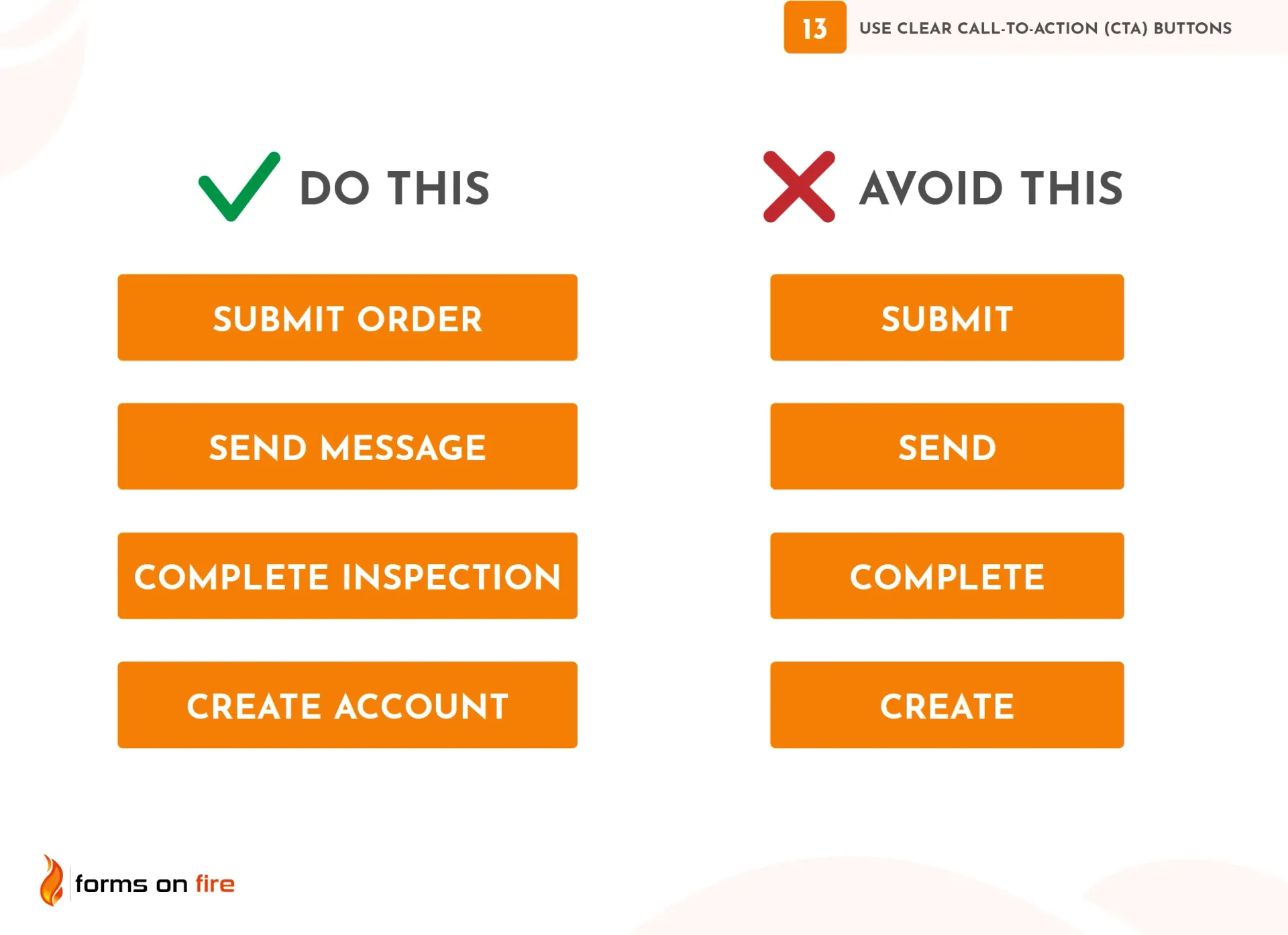
In summary, to encourage action and ensure a smooth user experience, your CTA buttons should be highly visible, easy to understand, and actionable.
Why having mobile-friendly forms matters to a business?
Mobile-friendly forms are essential for ensuring a smooth user experience. Whether your team is in the field or your customers are filling out forms on the go, responsive design ensures forms are easy to complete on any device. This leads to fewer errors, faster submissions, and higher completion rates—key benefits for both productivity and user satisfaction.
Simplify mobile app form design with Forms On Fire
Creating effective mobile forms shouldn’t be a time-consuming or technically challenging process. Whether you’re building forms for inspections, audits, data collection, or internal workflows, Forms On Fire allows you to design, deploy, and manage mobile forms with ease.
Here are some of the main features our platform offers:
- Responsive mobile design: Forms On Fire ensures that your forms are responsive across all mobile devices, automatically adjusting the layout for different screen sizes.
- Pre-made templates: We offer a library of pre-made templates designed for various use cases like audits, safety inspections, surveys, and data collection. You can select any of them and customize them to suit your specific needs.
- Built-in field validation: The platform offers easy-to-use validation tools, allowing you to specify required fields, acceptable input formats, and numeric ranges with just a few clicks.
- Conditional logic: You can easily set up conditional logic, hiding or showing fields based on a user’s previous responses.
- Offline capabilities: In many field-based industries, users may need to complete forms in areas with limited or no internet connectivity. Forms On Fire allows users to complete forms even when they’re offline. Once they’re back online, the form data will automatically sync with your systems.
- Advanced data collection: The platform allows you to integrate additional data collection features such as GPS coordinates, photo uploads, barcode/QR code scanning, digital signature capture, and more.
- Customer support throughout the process: Our amazing support team is ready to guide you throughout the whole process —- from form creation to deployment — so you never feel stuck.
To get started with Forms On Fire, all you need to do is sign up for an account, choose a template (or start from scratch), and begin building your form using our drag-and-drop editor. Once your form is ready, you can deploy it to your team members or customers, who can access it via the mobile app and start using it immediately.
The platform also integrates with popular software tools like Google Sheets, Microsoft Power BI, Dropbox, and more, enabling seamless data management and collaboration.
By leveraging a platform like Forms On Fire, you can streamline the entire process of creating and managing mobile forms.
Whether you need a simple data collection form or a complex multi-step form for field inspections, we make it easy to build professional, mobile-friendly forms in no time. Learn my by scheduling a demo or starting a free trial.


